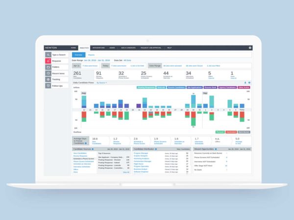
Newton (an Applicant Tracking Software platform) has always offered easy to interpret analytics for users who want to check performance at a glance. Unfortunately, having been developed in the early days of the platform and then left untouched, not only was the analytics area showing its age from a design perspective, it was also Flash based. With browser support for Flash coming to an end and a widely accepted distain for the kind of skeuomorphic design patterns employed in the analytics area, it was time for an update.
With a strong current basis to work from I and my team engaged with surveyed current users of the platform to identify what improvements they would want to see from a new analytics area. The results largely focussed on three areas:
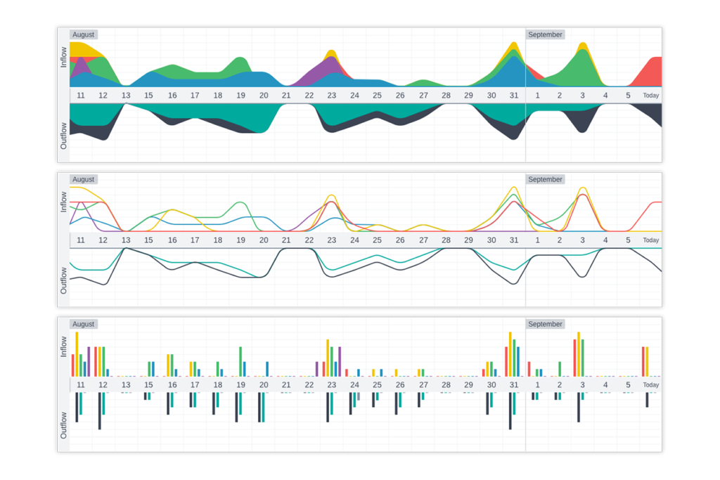
With the results of the user study in hand, I worked with a member of my team on producing some initial mockups of graph styles that might better represent the chart’s candidate flow data.
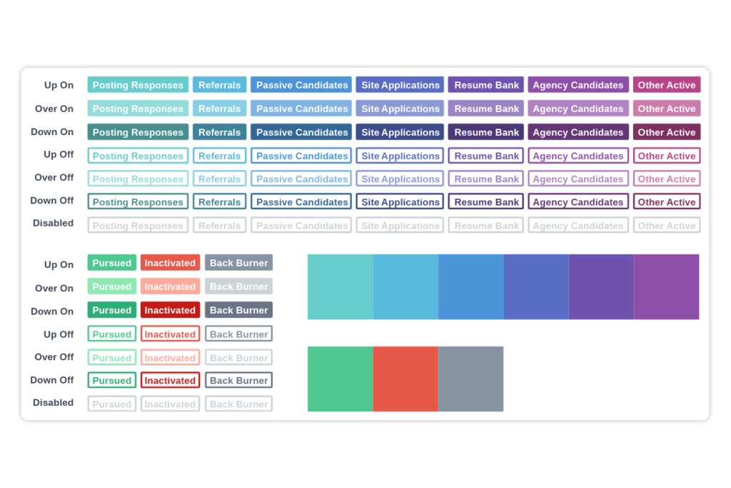
With a focus on creating an analytics area that is usable by users who are vision impaired, we opted for a compound bar chart. This approach not only leant itself perfectly to the data being displayed, it meant that totals and trends could be easily identified even if some users were not able to discern specific chart sections. To further support these users we chose to offer the ability to single-out specific sections of data. A new palette was created that would be cohesive with Newton’s purposefully limited color selection but that would support the range of data points on display at any one time.
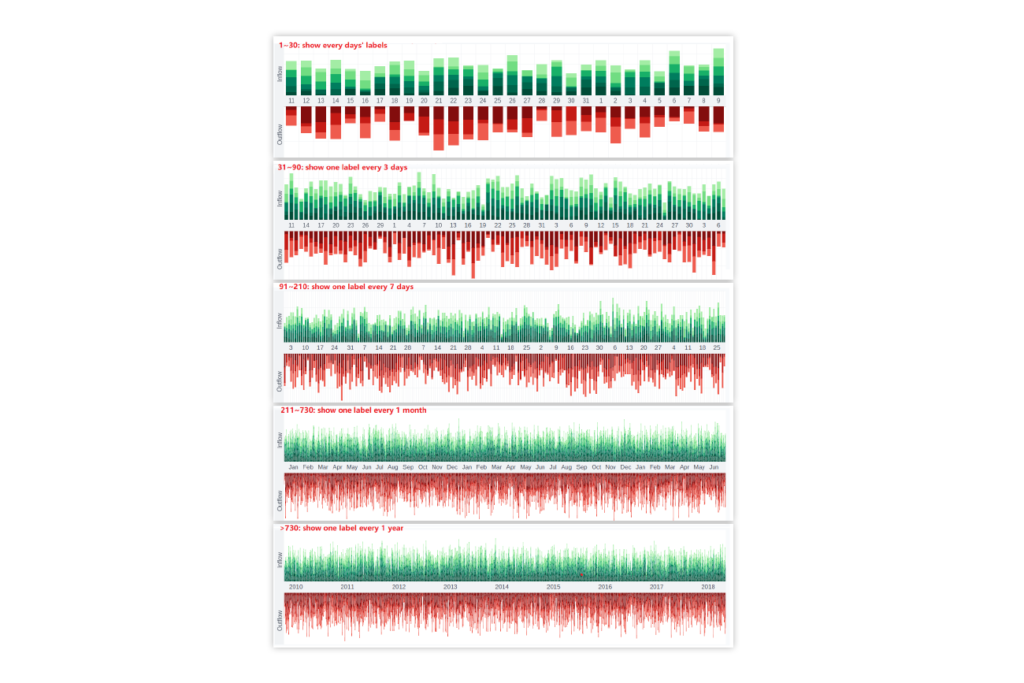
Following several iterations and additional user testing involving hi-res prototypes, I and my team supported the implementation of this complex project. I worked with key members of the dev team on defining algorithms that would control how data would be labelled in a usable manner across various ranges and at various resolutions.
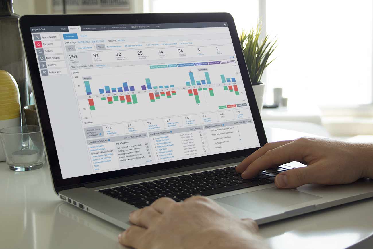
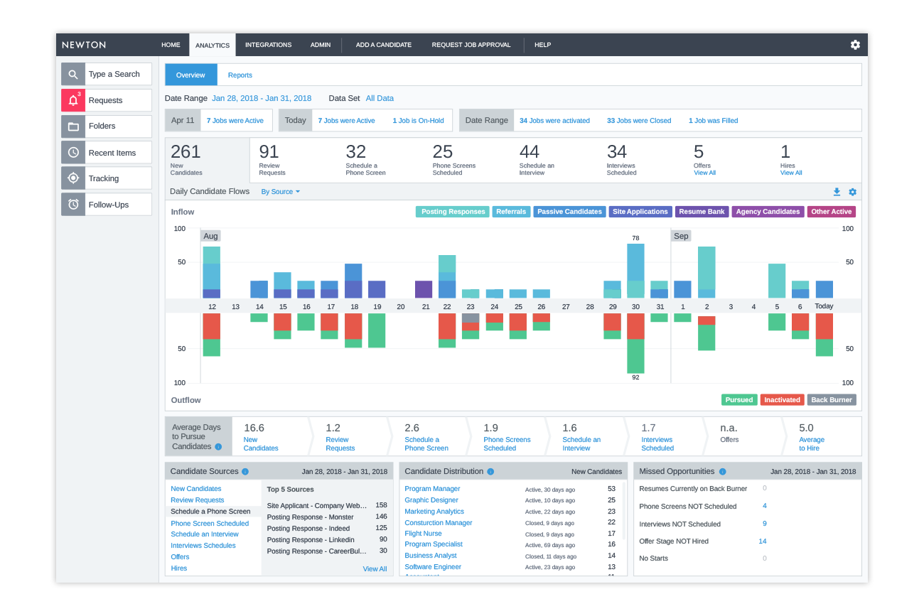
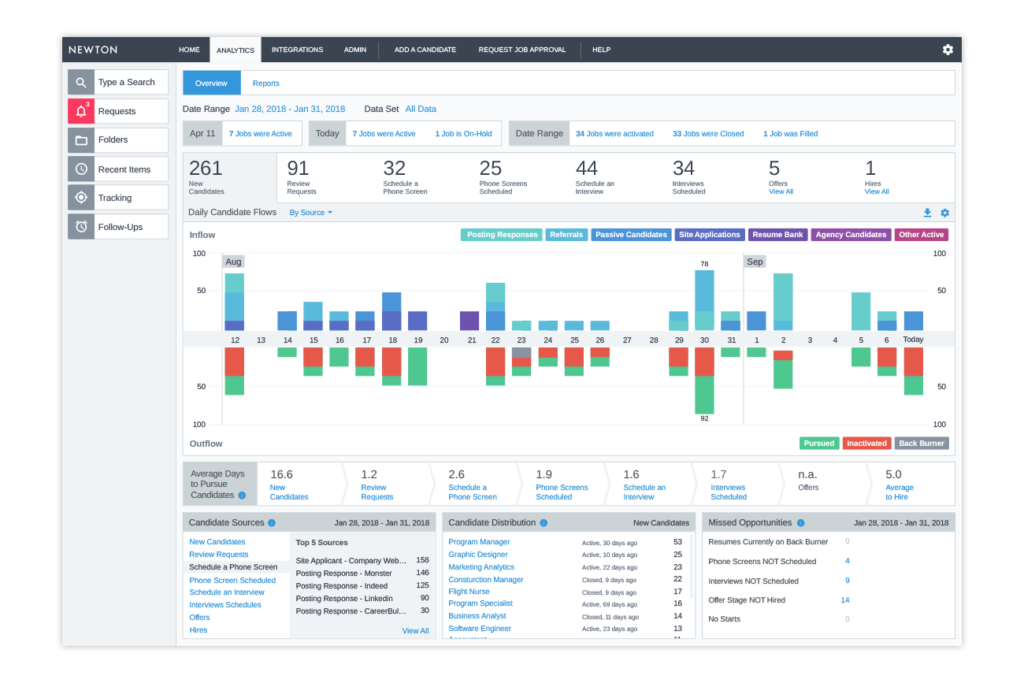
A new, speedy, accessible, HTML-5 version of the analytics area is now in use in the platform and regularly receives positive feedback from users.
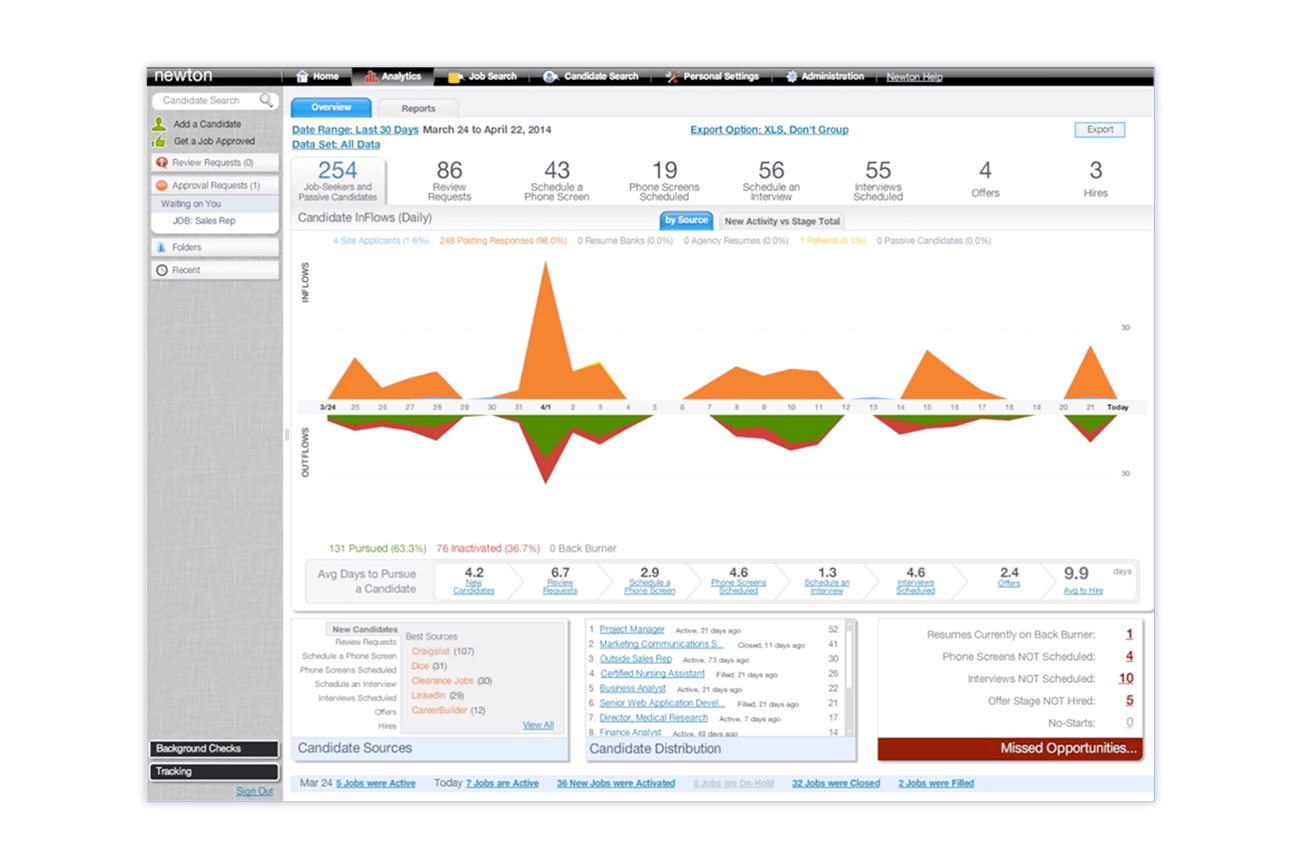
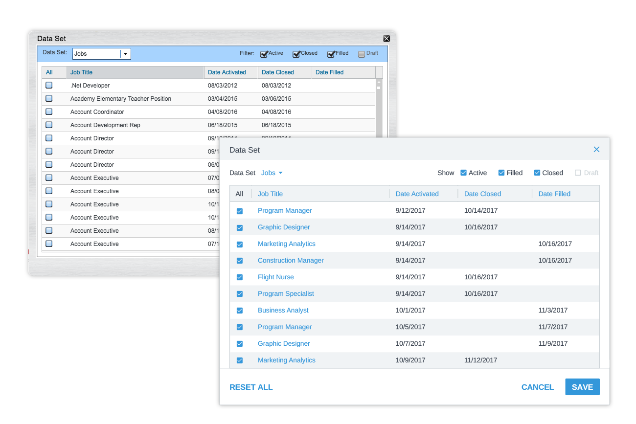
The original Flash-based Analytics area
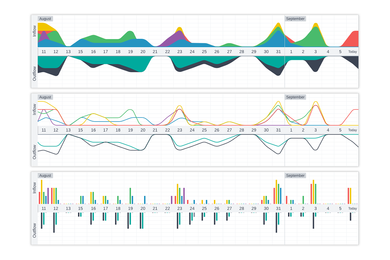
Research conducted into chart styles
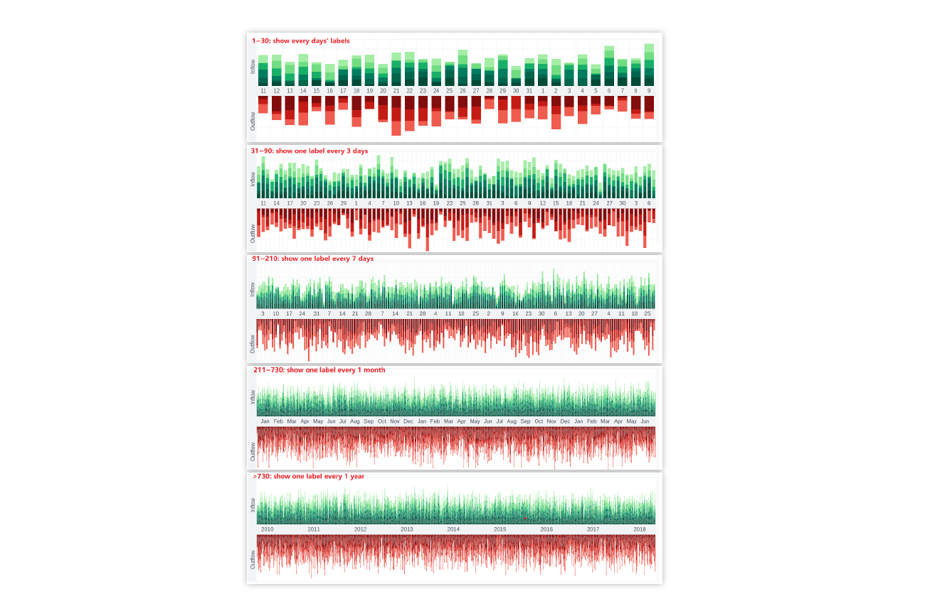
Algorithms for labelling ranges and viewport resolutions
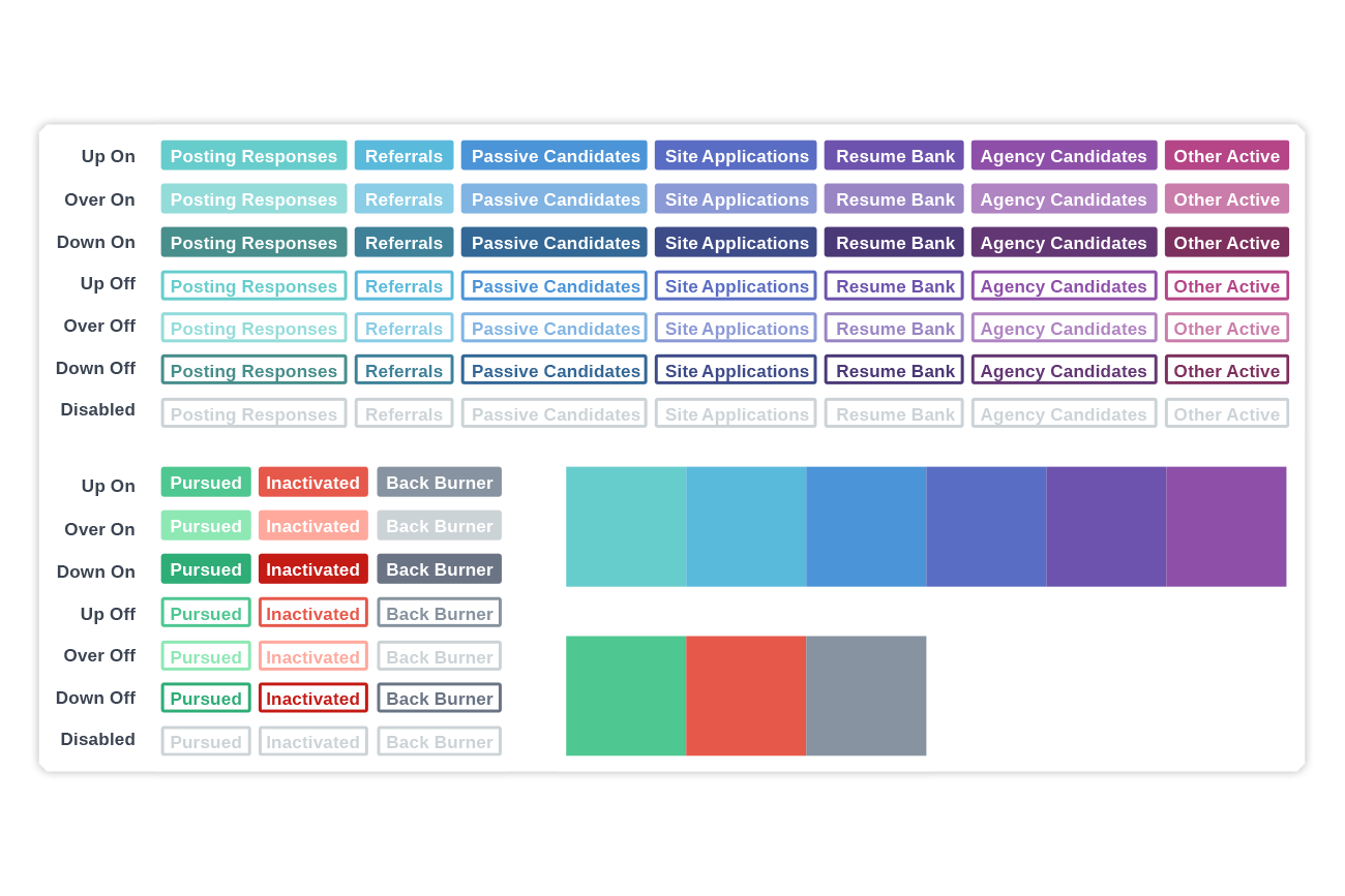
Defined palette with legend states
Updated Analytics area
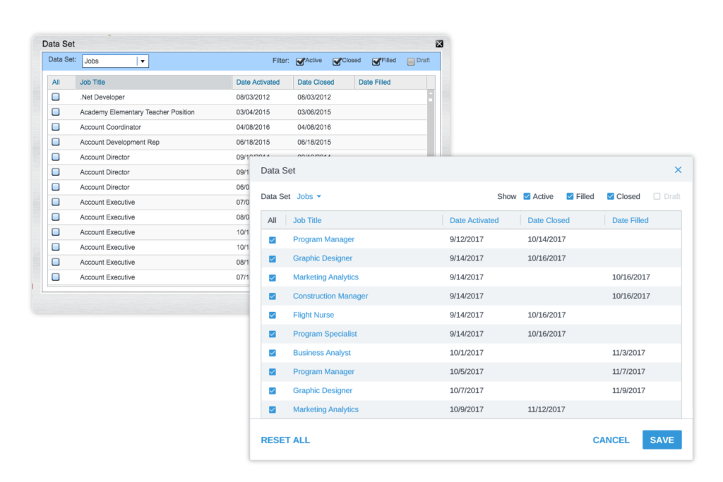
Brushed metal popovers updated
Newton (an Applicant Tracking Software platform) has always offered easy to interpret analytics for users who want to check performance at a glance. Unfortunately, having been developed in the early days of the platform and then left untouched, not only was the analytics area showing its age from a design perspective, it was also Flash based. With browser support for Flash coming to an end and a widely accepted distain for the kind of skeuomorphic design patterns employed in the analytics area, it was time for an update.
With a strong current basis to work from I and my team engaged with surveyed current users of the platform to identify what improvements they would want to see from a new analytics area. The results largely focussed on three areas:
With the results of the user study in hand, I worked with a member of my team on producing some initial mockups of graph styles that might better represent the chart’s candidate flow data.
With a focus on creating an analytics area that is usable by users who are vision impaired, we opted for a compound bar chart. This approach not only leant itself perfectly to the data being displayed, it meant that totals and trends could be easily identified even if some users were not able to discern specific chart sections. To further support these users we chose to offer the ability to single-out specific sections of data. A new palette was created that would be cohesive with Newton’s purposefully limited color selection but that would support the range of data points on display at any one time.
Following several iterations and additional user testing involving hi-res prototypes, I and my team supported the implementation of this complex project. I worked with key members of the dev team on defining algorithms that would control how data would be labelled in a usable manner across various ranges and at various resolutions.
A new, speedy, accessible, HTML-5 version of the analytics area is now in use in the platform and regularly receives positive feedback from users.
